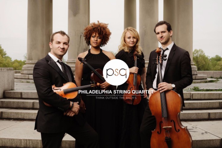
Two things can attract new clients to a creative small business - strong referrals and a stunning portfolio. This is especially true for the Philadelphia String Quartet, a live music company that mashes classical music with pop tunes. With over 100 happy reviews and a 5-star rating on Wedding Wire, the quartet knows how to make an impression. One customer raved:
“Adding the Philadelphia String Quartet to our wedding ceremony was one of the best last-minute decisions we could have made! All the songs we chose were modern, which PSQ does such a great job translating into strings. Would hire them again for sure! They were worth every penny!”
The Philadelphia String Quartet’s clients are awesome at communicating their musical skill and unique angle. But what about the band’s portfolio site?
First a bit of web history that every creative business should know:
In 2010 Steve Jobs penned an open letter explaining why Apple’s iPhone and iPad do not run Flash. At the time Flash was the most popular way media-rich websites were built. If your site displayed loads of photos, videos, and music, (like all online portfolios) then it most likely relied on Flash.
The lack of support from Mr. Jobs meant that everyone who bought one of Apple’s new iPhones were not able to view a Flash-powered site. Suddenly a very modern Flash website appeared broken to most mobile phone users.
So websites slowly transitioned to HTML5, a new way to include media and interactivity on your webpage, in ways that were previously only possible with Flash.
Because most new sites launched with HTML5, the technology became associated with a modern look and feel. A Flash-based website now appears antiquated, even though it may work on laptops and non-Apple phones.
The Philadelphia String Quartet had a problem. Their Flash heavy website whispered “out-of-date”, even though their beautiful portfolio trumpets “hip and professional”. It was time for an upgrade.
The quartet booked our portfolio styling service with Ashley R., a talented in-house PhotoBiz designer. The band told Ashley to create a new site and logo that matches their brand statement - “Mr. Mozart meets Lady Gaga”. The site had to be “clean” and “easy-to-digest” for clients, and their photos and music had to take prominence in the design.
Ashley took their requirements and created a set of logo treatments for the band to choose from. Originally the quartet asked for a scripted font within a circle, but Ashley saw that the “P” and “Q” didn’t quite work with that look. As an alternative she tested using a modern san serif font where those two letters mirrored each other.
The new logo, paired with their attractive portrait photo communicates the core of the band’s story in just a glance. So Ashley redesigned the portfolio site with the logo and portrait both centered on the page.
Using HTML5, Ashley and the PhotoBiz team left Flash behind and launched the Philadelphia String Quartet’s new website. Clients can now browse the site on their iPhones as easily as they can on their laptops. And the company’s online portfolio is now worthy of the their talent and reputation.
“[Ashley] was very responsive and working with her was like a breath of fresh air” the quartet wrote to PhotoBiz. “We are so grateful for her help and talent and I would recommend her work to all my friends”.