The fonts on your website are the last thing you think about, but the first thing your visitors notice.
A bad font choice can clash with your overall site design and make your text unreadable. On the flip side, a smart use of fonts will quietly communicate your brand, enhance the presentation of your portfolio, and make your target customer instantly feel at home.
You don't have to be a designer to learn the ins-and-outs of picking the best fonts for your website. We'll break it down into four key things to consider when choosing fonts for your website.
1. The Basics: typography isn't about finding a "cool" font
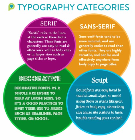
If you're new to learning about typography and design, we'll start with a short crash course to get your feet wet. Fonts usually fall under one of these main categories:
- Serif
- Sans-Serif
- Decorative
- Script
Below is a cheat sheet so you can see these in action, complete with some examples of how you can use each type on your website.
A common misconception is that to make text content visually appealing, all you need to do is to put it in a "pretty" font.
However, there's a lot more that goes into it than just selecting a font for your content. It's also important to implement a clear visual hierarchy on your page, especially if the text is long. An easy way to do this is to make sure your page titles are in a larger font size than the other copy on your page. Also break up long paragraphs of text to make it easier to read. You can separate it into columns, or use elements such as bulleted lists.
2. Fonts are more powerful than you think.
Did you know that your font choices have the ability to change the impression your website gives your visitors? (Yeah, they're that powerful.)
In fact, most people never think about it, but font choice has the ability to alter the perception visitors have not only of your website, but more importantly, of your brand. That's why a good rule of thumb is to always consider your audience when picking a font. This is true not only for fonts on the web, but in print as well.
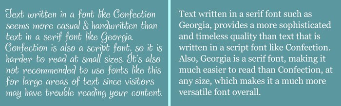
For example, if you provide a high-end service for your customers, and you want your website to show that your brand is established and sophisticated, then it's a better idea to use a more timeless Serif font such as "Georgia", than a more casual one like "Confection" as the main font on your website. You can easily see what I mean in the example below.
Which one looks more sophisticated?
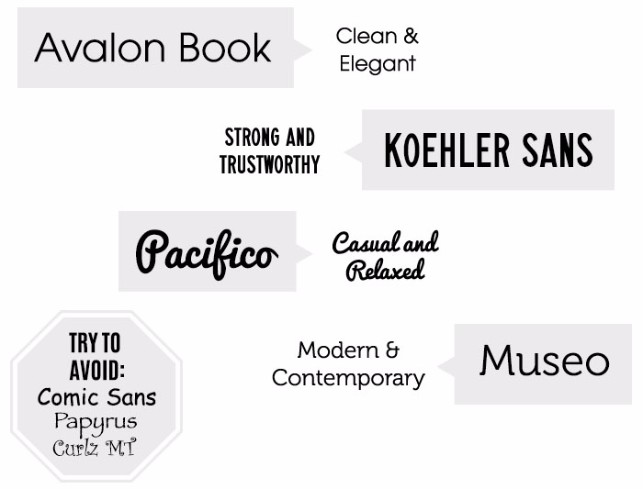
Every font tends to evoke it's own unique mood. For instance, take a look at the following fonts and how dramatically different messages they can convey to the viewer.
3. When in doubt, keep it simple.
With the variety of fonts available nowadays, more often than not I've seen a great looking website suffers from a case of what I call "Too-Many-Fonts-itis"
That's what happens when too many fonts are fighting for the viewer's attention on a single page. When Too-Many-Fonts-itis occurs, there's no clear visual hierarchy, which leads the viewer to get distracted and eventually leave your site.
That's when it's time to use font pairings.
Font pairings are combinations of fonts that compliment each other. A great way to experiment with font pairing is to check out a font pairing resource, such as the awesome site Type Genius. You can select a starter font from a drop-down menu, then the site generates a font pairing and shows an example screenshot of the pair in action.
In general, the most popular question I've heard asked about fonts on a website is "How many fonts should I have on my site?" My answer is always the same; don't overthink it, and when in doubt, keep it simple. Essentially, if you can use 2 fonts to convey your message clearly instead of 3, then by all means, just use 2. I usually recommend 2-3 fonts at most on a single website.
4. It's okay to use tools.
Last but not least, I want to close with some solid advice. It's always okay to reach out and ask for help if you need it, and use tools to save time. It's always better to work smarter, not harder.
With that said, you can always give our incredibly talented Passionate Support team a call if you have any questions about fonts, or even if you just need a second opinion on what fonts to pair up on your website. No question is too big or too small!
If you're looking for some ways to experiment with font pairings, or want to learn more about fonts, there are lots of awesome (and free) tools out there to help. Below is a list of a few of my favorite resources when it comes to fonts on the web:
- Fontpair.co - This is a site with tons of examples of ways to combine the various fonts available in the Google Font library. This is an awesome resource because most of these fonts are available in the font bank in your PhotoBiz Control Panel. If you get inspired by a combination, all you have to do is log in and update your site!
- Butterick's Practical Typography - This is a free web-based book all about typography. It also includes a great "Typography in Ten Minutes" section if you want to expand upon the basics you learned in this post.
- Fonts.com's Fontology - A great free self-study e-course for those interested in learning more about the foundation of typography as well as its practical uses.
- 100 Free Fonts You Should Be Using in 2015 - This is a great post from the team at Canva that has a comprehensive list of free fonts, and I love that their team has organized their list by font category to make it easier to find the perfect type of font you're looking for.
I hope these tips help make picking the perfect font for your website less daunting! Do you have a favorite font combination? Let us know in the comments!