With so many great designs, it can be overwhelming to choose just one that fits your brand and is harmonious with your logo, promotional pieces and style of photography. Especially as a creative! Hey we like a lot of stuff – I get it!
So how do you make sure you avoid a branding mishap when you’re implementing a new website? Here are 3 branding mishaps to avoid when designing your new website.
1) Protect Your Logo Like an Endangered Species.
While you should LOVE your logo and want to see it everywhere, you should protect the elements that make up your logo – from the fonts to the special graphic elements. Your logo is a special mark that identifies your business. And because of that, it needs to stand out. It can be tempting to use that special font in your logo everywhere, throughout all of your marketing pieces and website, but the fonts you use in your logo shouldn’t appear anywhere else, especially if it is created from an extremely stylized font. While there are a few advanced exceptions to this rule, for the most part when choosing fonts for your website pick contrasting fonts that compliment your logo. Don’t compete with your logo for top billing. Instead choose fonts that make your logo stand out as special.

2) Coordinate Don’t Clash.
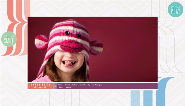
Yep. We like a lot of things. But just like when decorating your home – when it comes to your website, you need to choose a design that coordinates with the style of your photography. When creating your website start by thinking about all of the design elements involved - the patterns, the colors, the look and feel. Are these consistent with your photography? For example, is your photography fun and bright? Or soft and romantic? Or contemporary and clean? Your website needs to complement NOT clash with the style of your photography. The website design you choose should be dictated by your photography and remain consistent throughout your marketing.
3) Specialize Don’t Generalize.
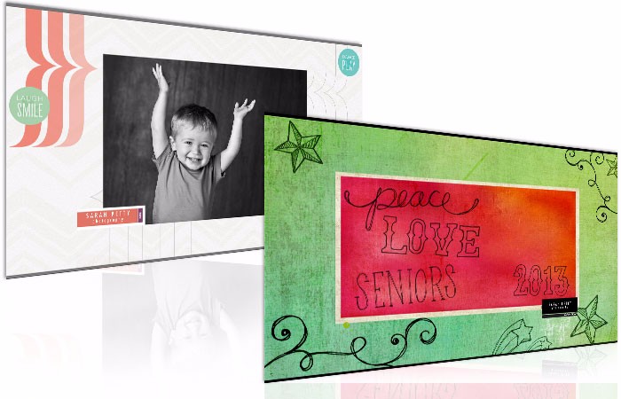
When you try to be everything to everyone you end up delighting no one. It’s true – nobody is thrilled by you. We all choose to do business with people who we think are PERFECT for us and understand our UNIQUE needs. So if you have different target markets – brides and new mommas - it is okay to have more than one website! Your bride wants to believe you are the expert at photographing weddings and all things weddings. She’s eating, sleeping, breathing her wedding and wants you to as well. She doesn’t want to think about you posing babies. And the same is true for that new momma. She wants to trust that you know what to do with her perfect baby – not that you’re worrying about editing all the images for last weekend’s wedding. Each target audience has different motivations, reasons for wanting photography and differing budgets. If you use one website to appeal to both, you may alienate both audiences. It can benefit you to speak differently to each target market. Check out how we have done for my two target audiences in my baby/kid business and my high school senior business at sarahpetty.com and sarahpettyseniors.com.
There are a ton of decisions that go into branding your photography business. And there’s a lot of details to keep straight when building and maintaining a strong brand. To ensure I don’t confuse my clients with my branding efforts, I have a graphic standards manual I use that provides me and my staff with guidelines on how I can and can’t use my brand. To grab a copy of my 10 page PDF graphic standards for free go to www.thejoyofmarketing.com/iusa.