LOGIN
Our Favorite Font Pairings
Leave this field empty
Wednesday, March 08, 2023
By Meredith W.
Pin It

Originally published: August 9, 2017

Your font selections are very important when designing your website! They can influence someone’s decision to explore and read the information on your website or quickly leave. Why? If the fonts on your website are hard to read, your visitors may not stay long enough to learn more about your company.

So, how do you choose fonts? Let’s start with a couple font basics:

Serif, sans serif, monospace, script, and handwritten fonts

A font family is a group of fonts with similar attributes. Most of the time you’ll want to use serif or sans serif fonts.

Serif fonts have little feet or notches on the letters. They work well for headlines and body copy (large areas of text). A classic example is Times New Roman.

Sans serif fonts don’t have feet. Sans serif fonts also work well for headlines and body copy. Popular san serif fonts include Arial and Open Sans.

Monospace fonts feature characters that each take up the same amount of horizontal space. For example, an M and I both get the same space. These work best for headlines in all caps, and are not recommended for body copy because it can be hard to read.

Script fonts are designed to look like traditional hand lettering and calligraphy. They should be used in moderation, and work well as an accent. Do not use them for body copy.

Handwritten fonts are made to look like they were written by hand, usually with a pen or marker. They should also be used in moderation. They might work well for a header but will usually be harder to read as body copy.

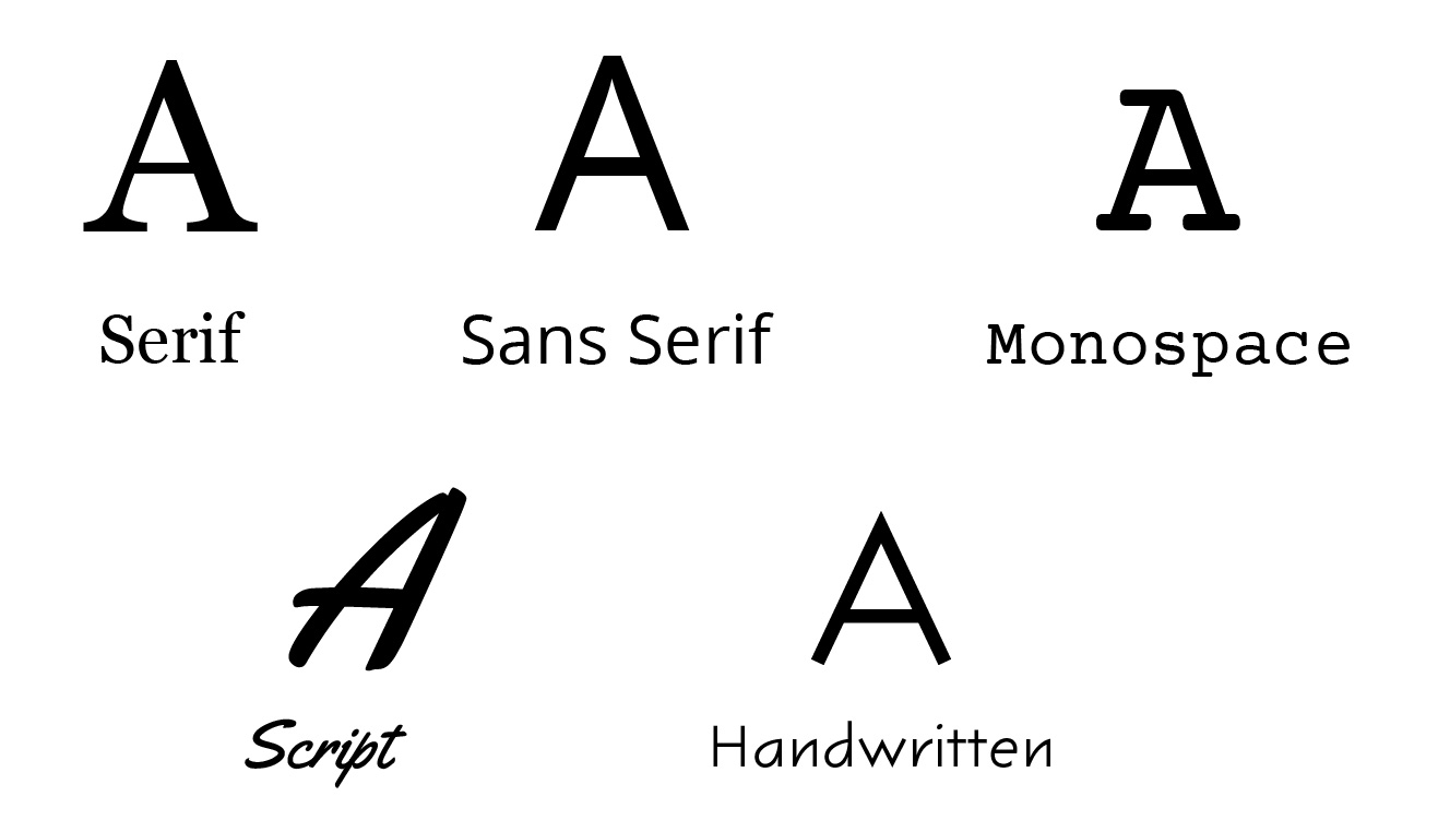
Different fonts for different feelings

To present a clear, clean, and consistent design, you should select a combination of fonts for your headers and body copy on your website. Different font combinations can convey different moods.

  • Sans serif fonts mixed with serif fonts are a very traditional combination.
  • Sans serif and sans serif pairings are a little more modern.
  • Serif and serif fonts together can make your website feel more formal.
  • Handwritten fonts paired with serif or san serif fonts can be a little more playful.

Go for contrast

The biggest piece of advice we can give is to go for contrast when selecting fonts. Contrast creates visual interest. It can also help people quickly see different sections of content on your website, encourage them to quickly skim over headlines, and decide where they want to read more info.

  • If you’re using a bold sans serif font for your headers, use a lighter weight serif font for your body copy.
  • If you’re using a large serif font for your headers, try using a smaller sans serif font for your body copy.
  • If your headers have really wide/extended letters look for a font that is a little more narrow/condensed for your body copy.

Consider using colors

Colors also play a role in how fonts behave. Headlines are the best place to experiment with colors.

For body copy, dark text on a light background is best for legibility. Light colored text on a dark background can be hard to read and should be used sparingly.

If you use colored text, keep your colors to a minimum — two to three colors at the most. Otherwise, your website may start to look like a chaotic rainbow.

Feel free to experiment!

Don’t be afraid to experiment with different font combinations to see what fits your brand. It is easy to change your font selections on the PhotoBiz platform. Remember to check out how fonts look on both mobile devices and desktop or laptop computers. Something that looks great on a large screen, may not work as well on a small phone screen.

Consider asking your friends and family what they think (just make sure they are representative of your target audience). It never hurts to get extra opinions! They may see something you don’t.


Here are some of our favorite font pairings for websites. All of these fonts are available in the PhotoBiz website builder.

Sans serif & serif fonts


Serif & sans serif fonts


Sans serif & sans serif


Serif & serif fonts


Monospace & sans serif


Monospace & serif


Script & sans serif


Script & serif


Handwritten & sans serif


Handwritten & serif


To learn how to use fonts in the PhotoBiz website builder, check out these resources.

Have questions about fonts? Give our support team a call at 866.463.7620 or start a live chat.

Leave a comment: